Thursday, May 12, 2011
Questionnaire
We provided a test screening for our audience and created a questionnaire to find out what people outside of our group truly thought of out film. The screening we showed was not the final version of our film as we wanted to get the audience opinion on how to finish the film.
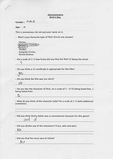
These are some quotes of the feedback:
- The second piece of music we used was too depressing and took the humour out of the film.
- The volume of some of the dialogue needs to be increased.
The piece of feedback we received was that the music was too overpowering in the real sequence.
Final Magazine Article
1st Draft Magazine
Research Magazine Articles
Disc Design
Final Poster
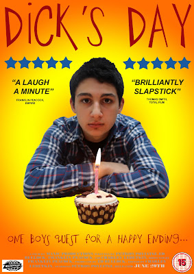
It was Edward Bullocks role to create the poster. He did this by using photoshop. We looked at all of our researched posters and decided this was the best design. This is because t portrays what the film is about. It have a very vibrant and optimistic background and a very gloomy and pessimistic. We also asked our audience what they thought of our poster and with their feedback we were able to create a poster that is of a high standard.
Poster: First and second draft
Ideas For The Poster
We decided that the best way of creating are own poster was by looking at the conventions for each genre. Our film is a teen comedy, to create a suitable poster for our film, we looked at other teen comedies that are some what similar to our with the humour. Taking into account the layout, font and colours, I feel that my group and I have created the perfect poster.
Wednesday, May 4, 2011
Final Cut Pro
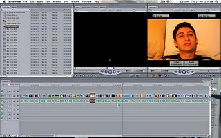
This is a screen shot of the software Final Cut Pro. This is the software we used to edit our film. To begin with we tried using imovie, but because we have past experiences with Final Cut and it is the professional software we decided to use this one. My role was to edit the picture of the film because I also edited my film for my coursework last year, using Final Cut Pro too.
Soundtrack Pro
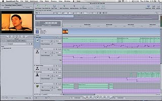
This is a screen shot of 'Soundtrack pro'. This is the software Petros Poyiatgi and myself used to edit the sound of our film. I believe we both had a minor advantage when put in charge of the sound because Petros also studies Music and I study Music and Music Technology, which means we are experienced in this field.
Music
Our group used the song 'Five Years Time' by 'Noah and the Whale' for the dream sequence, this is because it gives of the dreamy, happy feel because of the tempo of the song and the instruments used. While choosing this song, we had to come up with a solution that would prevent us from breaking the copyright law on the song. To do this we found a cover version of the song on 'Youtube'.
Our group also used the song 'Happy Ending' by 'Mika' for the end of the film to make the audience feel sorry for 'Dick'. Once again we had to find a solution to prevent copyright, so I had to make a cover of the song with a backing track found on 'Youtube' once again.
Monday, April 4, 2011
Planning Our Shoot
Planning Around Our Lessons
Monday, January 17, 2011
Cameras We Used
New Script
We have had a new idea again. It is that our main character 'Dick' has a dream. This dream is his ideal birthday and everything goes to plan and falls in his favour, he gets a car for his birthday, he gets pulled inside 'the girl next door's' house, everyone is wishing him happy birthday and he has a great day. But then he wakes up. This is a great advantage to us because we can constantly remind the audience of the dream and the fact that the normal day doesn't go to plan and throughout, Dick is noticing things that he saw in his dream and he wants them to be real. but it doesn't turn out that great for him.
Subscribe to:
Comments (Atom)


